Opinions ideas logo Redline @ OC3D !

SnW

New member
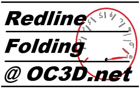
Hey guys just needs some suggetions ideas on a Redline @ OC3D logo,

or if you like it post it up
smile.gif


Proto2 needs some AA on some levels...

and replacing the OC3D logo i just noticed...

http://i52.tinypic.com/24bky7t.jpg

Proto2 want to do something with the FAH protiens pics but not sure what?!..

http://i54.tinypic.com/219nzly.jpg

I have the .PSD as well so if you want to update adjust it, i am happy to send you the .PSD...

Happy Folding and i´ll keep a eye on this thread !
 
Looks awesome! A few suggestions though. I think you should make the OC3D logo smaller. Keep it centered, but make it small enough to fit between the writing and the team number. If someone didn't know that was OC3D's logo I don't think they could make it out as one.

You should put PPD somewhere on there too so the gauge looks like we are redlining on PPD. Change the colors up as well. Instead of the whole gauge being red along the tick marks, start out with other colors so it looks like we are redlining, just like an RPM gauge is set up.

I like it better without the proteins at the bottom. It's nice when everything is contained in the circle logo. Perhaps if you decrease the OC3D logo size, you could fit one of the proteins by the team number.

Nice job, Ray!
 
I was playing with something like this. Maybe have a black/grey version of the OC3D logo as the face of the Speedo?

Also, that should be:

Redline

Folding

@ OC3D.net


Or is this better:

Redline

Folding

@ OC3D.net
 

Attachments

  • Redline Logo.jpg
    Redline Logo.jpg
    59.6 KB · Views: 102
Looking good Ray! I knew you would show us some top notch stuff!

Maybe it could say "PPD Tachometer" or something like that...and maybe show the needle bouncing as if it were moving toward more RPM/PPD..
 
Thanks for the positive replies but when i look at it now it looks awefull
wacko.gif


looks like one hell of a rush job ..everything is out of place ..
 
Thanks for the positive replies but when i look at it now it looks awefull
wacko.gif


looks like one hell of a rush job ..everything is out of place ..

All the radiuses being different are the reason it didnt look right to me :/
 
PS elements trial downloaded and this is my first effort,
98580869532327959999.jpg


Was trying to blend OC3D colours to match the rev counter but have not learnt that bit yet
smile.gif


Off to watch Silent Witness
 
^^ lol, so easy to say, but I know what you mean and will have to try that tomorrow I also think it needs www.overclock3d.net on there somewhere as well. I should really post the PSD file for people to play with as well see link

here
 
Really really like it! A bit more blending on the layers and it'd be perfect!

Nice one dude!
 
I really like that as well. I'd put the needle higher up on the scale though, like it's actually redlining...and I'd change the team number to 98860
wink.gif
. Other than that, it's just about perfect I'd say.
 
Back
Top