maniac
New member
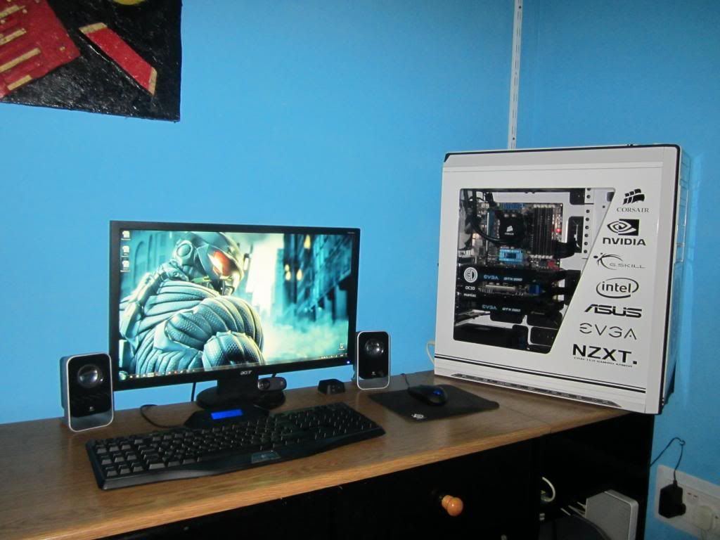
Quickly roughed this out in ps. but this is closer to what i'd consider better (i'm about to leave for home so i rushed)
Edit: i'd have the dot off that NZXT for definite though.
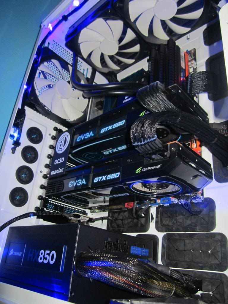
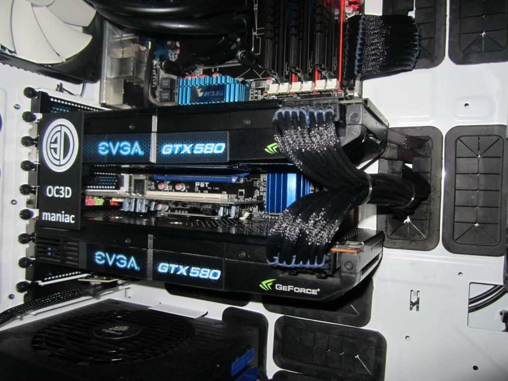
ok fair enough, the intel logo is somewhat smaller than the g.skill one and it should go in a higher position, the thing is that I designed them with photoshop and the decal shop has to design them again to be able to be cut with the machine, and I believe the g.skill one had to be designed by hand as he couldn't find the logo online so some error could have been done in that point. This is what the original image looks like. As for the dot on the nzxt logo, it is part of the logo so I'll leave it there......for now !
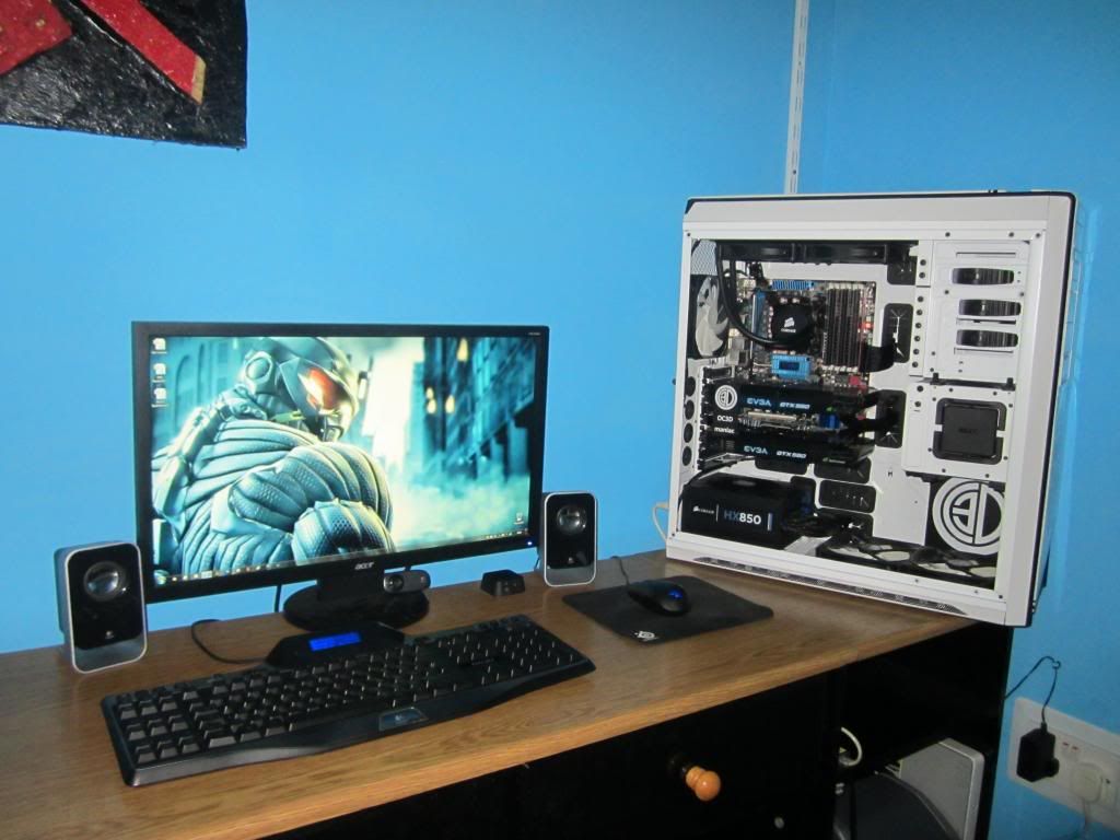
*original mock up*

 h34r:
h34r:")

 ) the TV show is pretty
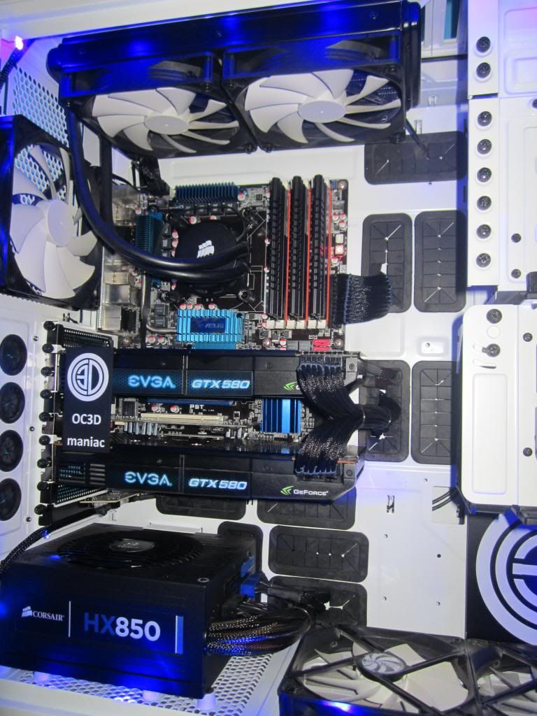
")